Metal business cards are a flex. Fine. But they’re also a tool. If your card looks expensive and still makes someone squint, guess what they remember?
Not your name.
The “forever” problem: metal doesn’t forgive bad info
Paper cards can be reprinted on a whim. Metal Kards tend to stick around, on desks, in wallets, in that drawer people swear they’ll organize. That durability is the whole point… until you engrave something that changes every six months.
So design for stability. Your job title might evolve. Your email probably shouldn’t. Your TikTok handle? That’s a coin toss.
One-line rule I use: If it’ll be true a year from now, it earns a spot.
The non-negotiables (yes, you still need the basics)
You want someone to contact you quickly, correctly, and without weird friction. That means a clean block of essentials:
– Name (largest text on the card, always)
– Role/title (one line; no corporate poetry)
– Company/brand name
– One primary phone (the one you actually answer)
– One direct email (preferably on your domain)
– One link (portfolio, booking page, or a “start here” hub)
That’s the core. Everything else is optional and should feel like it fought for its place.
Name + role: legibility is the real luxury
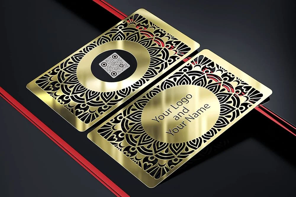
You can spend $200 on metal stock and ruin it with an over-stylized font. I’ve seen it happen more than once, beautiful card, unreadable identity. People don’t ask for clarification; they just mentally move on.
A few technical realities that matter on metal:
– Thin strokes break down in engraving/etching, especially on brushed finishes.
– Glare is real. Polished metal + low contrast text = unreadable in half the rooms you walk into.
– Small type doesn’t age well once the surface gets micro-scratches from pockets and keys.
Go with a clean sans-serif, medium-to-bold weight, generous spacing. Make the name visually dominant. Treat the role like supporting cast.
Now, this won’t apply to everyone, but if your title takes more than a heartbeat to parse, simplify it. “Growth Strategy & Cross-Functional Partnerships Lead” isn’t helping you.
Branding that actually works on a card (not branding theatre)
Logos are fine. Taglines can be fine. What I don’t love is the “mission statement on titanium” trend.
Here’s the thing: a metal card already signals premium. You don’t need to cram in extra persuasion. Your branding should be a clue, not a dissertation.
If you include a tagline, make it specific enough to mean something. I’d rather see:
> “Brand identities for SaaS teams”
than:
> “Innovating the future of excellence”
One of those starts a conversation. The other ends it.
Phone and email: choose like you mean it
Pick the contact methods you’ll respond to quickly. Not the ones you aspire to use.
Phone
Use a single number. Label it if needed (Mobile / Office). Add a country code if you do business internationally. Don’t make people guess.
A domain email looks more serious and is easier to trust. Also, it tends to survive longer than a random inbox you created in 2017. If you must use Gmail, keep it short and clean. No underscores. No “official.biz.inquiries”.
One email. One phone. You’re not building a directory.
Social handles: include them only if they close deals
Social links are either credibility boosters or dead weight. No middle ground.
Include a profile only when:
– it’s active,
– it’s relevant to your work,
– and it’s something you want a new contact to see.
LinkedIn is the usual safe pick. Instagram can work for visual portfolios. GitHub makes sense for developers. Beyond that, I’m skeptical.
And please don’t slap five tiny icons on metal and pretend it’s “modern.” It’s just noise (and noise is hard to engrave cleanly).
QR codes and URLs: useful, but don’t get cute
QR codes can be great on metal, but only if you respect the engineering of scanning. Too small, too low-contrast, too glossy, and you’ve created a decorative square.
Practical QR guidelines:
– Keep it large enough to scan fast (don’t shrink it to “save space”)
– Place it away from edges and heavy textures
– Send it to one destination: vCard, portfolio, or booking link, not a maze
URLs are the slow-and-steady alternative. Short, branded, and readable. If someone has to squint and type 34 characters, you’ve lost them.
A smart compromise I’ve seen work: a short URL that redirects to whatever you want this year. The metal stays accurate; the destination evolves.
Address and payment info (usually) doesn’t belong here
Bold take: Most people put addresses on cards out of habit, not strategy.
If you run a local storefront, sure, city + street can matter. If you’re a service provider or remote consultant, a full address is often pointless and sometimes risky. City/region is usually enough for local trust without broadcasting where you live.
Payment handles are similar. Unless your business model relies on instant payment in-person, it’s clutter. Save it for invoices, proposals, or a link hub.
Design mechanics: metal is a different medium
Some cards fail because the information is wrong. Others fail because the surface fights the typography.
A quick specialist-style checklist:
Finish
– Brushed metal hides fingerprints and reduces glare
– Mirror finishes look premium but can destroy readability
Contrast
High contrast wins. Every time. Dark on light, or light-filled engraving on dark plating.
Spacing
Give text room. Crowding on metal feels worse than crowding on paper because the material already “reads” as dense.
Durability
Engraving depth matters. Ultra-fine etching looks sharp on day one and fades into mediocrity after a few months of friction.
One-line paragraph, because it’s true:
Less ink. More intention.
Networking card vs. sales card: they’re not the same beast
Networking is about follow-up and memory. Sales is about action and attribution.
For networking, I like:
– name + role
– a simple “what I do” line
– direct contact
– one link that helps them remember you
For sales-heavy contexts, I’d rather see a trackable route: a short URL or QR to a page built for conversion. Still clean. Still minimal. Just more measurable.
And yes, trackable links matter. In one survey, QR code usage among U.S. adults rose sharply during the pandemic era, with sustained adoption afterward (Pew Research Center has tracked shifting smartphone behaviors; QR-specific adoption has also been widely reported across payment and retail studies). You don’t need everyone to scan, just enough to justify the space.
What to leave off (if you want the card to work)
If any of these are on your draft, challenge them:
– multiple phone numbers “just in case”
– three emails (why?)
– every social platform you’ve ever created
– long titles that sound like internal HR classifications
– decorative graphics that compete with your name
– QR codes that point to something you won’t maintain
If it doesn’t increase contact rate, trust, or recall, it’s decoration. Metal makes decoration expensive.
Test it like a product, not a piece of art
Print prototypes. Hand them to real humans. Watch what they do.
I’ve run simple tests where people were asked to read a card, put it away, then repeat the name and contact method 60 seconds later. The “cooler” designs often performed worse. Not slightly worse, dramatically worse.
Measure boring things:
– time to find the email
– transcription errors
– scan success rate (for QR)
– what they remember without looking
Then iterate. Metal rewards the second draft, not the first impulse.
If you treat the card like a tiny interface, clear hierarchy, minimal steps, durable information, you end up with something that feels premium and performs. That’s the whole game.